More PowerPoint UI Potshots
Let’s pick on PowerPoint’s User Interface problems again! Won’t that be fun?
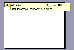
Here we are, about to edit a comment made to a PowerPoint 2003 document. The cursor is flashing, so lets start typing. What could go wrong?

BeeBeeBeeBeeBeeBeeBeeep
Hmm. Why isn’t it accepting our keystrokes?
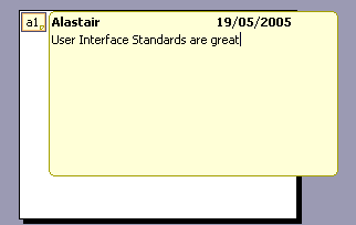
Turns out that the comment is not editable. This is what an editable comment looks like:

See? The two screenshots are completely different. One box is, like, bigger than the other!
Silly us. We forgot that Special Microsoft User Interface standard rule that non-editable boxes are smaller than editable ones. We’ll know next time. I mean, in retrospect it’s so obvious.
MS Office fans who may be suspecting foul Photoshoppery can follow along at home using these simple instructions:
- Open a PowerPoint document
- Insert a comment
- Click outside the comment box to reduce it to it’s “unopened” state
- Single-click on the minimised comment
- Double-click on a word to select it
- Single-click next to the word to de-select it
- Single-click again to put a blinking cursor in there
Boom! A non-editable comment with a flashing cursor.
This sequence of instructions sound a bit far fetched? Consider that the only way to get an editable comment is to close it, then double-click. This is not an obvious course of action when you’ve already opened the comment with a single-click. Instead you click around madly trying to work out why it won’t put a cursor down to edit the comment, and before you know it, you have! (Except it doesn’t accept keystrokes)
Something tells me I need to create a whole new category on this blog for Office 2003 UI gripes. Naah, that would be too obvious.
1 Comments