Bad Forms
In a previous rant, I mentioned the proliferation of ransom note typography as endemic in the corporate world, as a direct result of using WYSIWYG editors such as Microsoft Word. However there is a less common, but far more annoying, side effect of the Microsoft Word proliferation: forms.
In thinking about this for the prerequisite 30 seconds prior to blogging, I could not think of a single example of a form that I have been sent in Microsoft Word format that didn’t require me to play with the formatting or perform some other task other than entering the information requested. This is quite amazing when you think about it.
Over-generalisations are the prerogative, perhaps even obligation, of the blogger. So here goes:
(Except of course those produced by people likely to read this.)
Evidence, you say?
In this post-WMD world, you want evidence? Oh, OK then, for old times sake. Here are some samples taken from the top ten (out of 12.6 million) hits on Google for the query “form filetype:doc”. And querying Google is as close to a random sample as you’re likely to get on this blog.
-
Exhibit 1. An interlibrary request form. Looks like someone has eaten too many underscores and thrown up all over it. Click in the address field, type a few lines. Whoops! Where’s the right-hand column gone!? Despairing of technology, you decide to print it out and actually write in the space provided. Fine, as long as your handwriting is the size of single-spaced Times New Roman 10 point.
-
Exhibit 2. A military interdepartmental purchase request, SIR! This one is easy to pick on. It’s a big table, and look at all those rows. So it’s not likely that you’ll run out of space on the form. But if you do … well, you’re screwed. Fill out a second form, soldier. The layout of this form is password protected. It’s on a need-to-know basis, son! Now drop and give me twenty!
-
Exhibit 3. Surely the learned gentlefolk at the International Criminal Court must be able to drive Word, right? Well, I can’t tell you because it crashed Word. And the Error Reporting application used to report crashes. Next!
-
Exhibit 4. This form is something to do with signing your life away to a publisher. Another form that has been attacked by the Underscore Monster. But no, the first field is made up of tab characters, not underscores. Which means I can’t just double-click and start typing. Oh no. And look, the first field kinda continues to the next line. But this time it’s made of underscores. Bored now.
-
Exhibit 5. Some conference registration form. And look, each field of the form is in it’s own frame! Not only is it butt-ugly but I also have to click in each field before typing. I guess it’s too much to expect that I can use the keyboard to get from one field to the next.
I could go on. And I will.
Here is another example I encountered recently. A form for potential job applicants (no, not me) to summarise their experience in relevant areas. The headings are put into text frames, but are positioned relative to … well … something. Click and start typing in the fields. Hit return, and watch the headings march off to new and exciting realms of pagination. I really am not making this up, look:
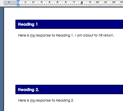
Hit return at the end of the line that says “I am about to hit return”:
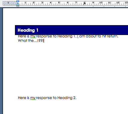
Heading 2 disappears! Where did it go? The top of the next page, of course!
Let’s Play the Blame Game
OK so there is a lot of breakage here. Some of it can be blamed on the technology, some on the form designer not understanding how to use the technology, and some on the form designer just not understanding the problem domain, irrespective of the technology.
But, in the interests of balance fairness, I have tried to ignore the suckiness of these forms that can be traced directly to limitations of Word itself. It only does checkboxes, not radio buttons. Fine. I’ve also tried ignore the presumption that the users of these forms actually have Microsoft Word in the first place.
And lastly, I have tried to ignore those that suffer from bad design; or at least not picked on them because of it. Information about humans is notoriously difficult to mould into a structured format and I don’t expect technology to help (much) in this regard. Good design is hard.
The point of this post is to rant cathartically show how the technology is ill-suited to the task at hand, and that at least some of the blame for this situation rests with the general principle of WYSIWYG.
I’m not necessarily saying that Word should attempt to put itself in a special form-editing mode which would produce forms of at least passable usability. Although, the thought of clippy popping up and saying “I’ve noticed you are trying to create a form, and you have the design skills of a three-year old” actually fills me with a strange sense of excitement. Actually what I’m trying to do is use this as another argument against the aesthetic and usability disaster that is WYSIWYG.
The Evil that Lurks in the Hearts of Word Documents
Lured by the promise of WYSIWYG, the form designers are obviously thinking more about what they see, rather than what the punters who will be filling out the form see. Forms are a particularly thorny case because you, as form designer, need to think about how the form will behave with the user’s data entered.
Forms expose the sordid underbelly of how WYSIWYG is actually used in the real world. “I want this text over there”, thinks the user. “by any means possible, I need to get to the pub for lunch”, they might well add. Instead of fumbling around to find the “put over here” menu command, they just fudge it. Centre some text? Click the cursor at the beginning of the line, and hold down the space bar until it looks roughly right. Want something bold? Just hit the bold button! Styles menu? Give me a break! Want a page break? Just hit return until the preceding text runs over to the next page.
All of this is fine if the document is printed out or just read on screen at the same resolution and page size as the author, and with the same fonts, gamma, etc etc. Maybe. But if the document is modified by someone else, the edifice of typographical duct tape and string comes crashing down. WYSIWYG encourages you to think about the appearance over all else. How the document looks, but not why it looks the way it does. And this understanding is necessary to designing a document which can be modified by others in a sane way.
In fairness to Microsoft, the InfoPath part of the Office suite looks like a great tool. Ever seen an InfoPath form? Me neither, but it looks like they’re at least recognising the right problem(s).
And until some better theory comes along, I am sticking to my over generalisation that every single form ever created in Microsoft Word is a piece of crap, not worth the paper that you shouldn’t print it on.
There, I feel better. Promise no more ranting against WYSIWYG for at least another week.
0 Comments