The Phoney Internet
One of the unexpected delights of getting a 3G phone was discovering how usable and addictive mobile internet access can be.
On the bus? Want to check your email? No problem.
In the queue at the checkout? Want to catch up on your blogs? Can do!
In the pub? Want to check the game scores? Forget it.
OK so everything isn’t as great as it could be, but lets not get ahead of ourselves. 99% of the time I’m just using either mobile Gmail or my blog aggregator, and they work great.
NewsGator Online Mobile
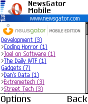
This is NewsGator Online mobile edition. No, no relation to that Gator.

A little while back NewsGator bought a small company called Ranchero, which makes the excellent Mac RSS aggreator NetNewsWire. As part of the deal, they gave a two year subscription to NewsGator Premium to all the people who purchased NetNewsWire. Like me.
NewsGator Premium includes a bunch of mostly useless stuff, with the notable exception of the mobile edition, which isn’t useless at all.
Unlike the Joneses I haven't been using Bloglines for a while now. It has a mobile version but I don't like it, or the full desktop version, as much as Newsgator's equivalents. However the advantages are fairly slim and without the NetNewsWire syncing I wouldn't have bothered switching. I will say that I have a lot more confidence in Newsgator's business model than the non-existant one of Bloglines.
Anyway it works very nicely. For that matter so does NewsGator Online through a regular desktop browser, and indeed NetNewsWire on a Mac. The great thing is that all these three synchronise seamlessly, including which articles you have read and which you haven’t. Read an article on your phone, mark it as read and you don’t have to manually skip it next time you log into the aggregator on your desktop. Trés bon.
I have only a couple of gripes. The inital setup is a bit tedious, as it involves typing in a long URL using the phone keypad. There is no authentication on this URL, so you just have to be sure not to publish it. And if you accidentally do publish it, the “mark as unread” operation is implemented as a GET, which means spiders may accidentally read all of your content for you. And it gets web-purist wannabes like me all riled.
On the upside, it turns out that using an RSS aggregator neatly solves the webpage bloatware problem. At least, it does for those blogs that publish full-text RSS feeds (unlike, err, the girtby.net feed). These sites generally render just fine and are stripped down enough to be quite viewable on the tiny screen.
Opera
Even when a website puts no effort whatsoever into making it accessible to mobile devices the results can be quite acceptable:

Behold Opera Mobile. Like its desktop cousin, this is a great browser. One thing you just can’t help noticing is how quick it is, especially in comparison to the default Symbian browser. It scrolls like butter!
As you can see, the quality of HTML rendering is great. I have been pretty careful to output “clean” HTML with no tables and CSS with no absolute width rules (for layout anyway). And fortunately most of the blogs that I read are laid-out with even more care and CSS competence than girtby.net. So the result is that blog reading on-the-go is a pretty pleasant experience: either you read the full-text RSS feed directly, or go to the site directly and find that it most often displays pretty well.
Even when viewing some dreadful outsourced corporate HTML atrocity, Opera makes a pretty good fist of it. There are many features to resize images and tweak the rendering to make these sites usable on a small screen. Opera 9 desktop even has a mode to impersonate its tiny cousin.
Mobile Content Standards
The history of mobile internet (and internet-like) content is somewhat amusing but it now seems that we are finally converging on XHTML Mobile Profile as a commonly-available but useful subset of XHTML for mobile devices, and all this WAP stuff is finally dying the death it truly deserves.
So in theory the variants of XHTML should make it relatively easy to adapt from full XHTML content. Perhaps even dynamically. The only problem is that the standards in this area are a little bit … non-existant. Well, there’s this old protocol called CC/PP which allows mobile devices to say “hey I have a very small screen” to a web server. But it doesn’t seem to have caught on and now the W3C is persuing it as part of the Device Independence WG. Although it is understandably tied to up-and-coming W3C standards like XForms and CSS3, the future does look interesting for device independence.
Until these standards see wide implementation (and they do seem a while off) the question of adapting existing XHTML content to be viewable on mobile devices seems to have very few good answers. For now each website has to be provided twice: one for the regular desktop shmoes and again for the Kids On The Street With Mobile Browsers. There doesn’t even seem to be good informal standards for accessing mobile content, although I quite like the “m.” domain name convention (e.g. m.gmail.com for the mobile version of Gmail).
Opportunities Begging
The usefulness of the mobile internet is really easy to see for some applications. Location-based services like Google Maps are obvious candidates for a mobile browser. Less useful but perhaps more compelling are the argument-settling sites like Wikipedia and IMDB. And obviously the news, sporting results, weather, traffic and all the other stuff that occupies every waking minute when we’re on the internet.
There are so many sites which are manifestly more useful when on the go, that it makes you wonder why more of them aren’t fully compatible with mobile browsers. In a lot of cases I’m guessing the hassle of maintaining the second mobile-only site is the major barrier, and to be honest I can’t say I’m shocked.
Economics also likely play a part too. Especially when your site is advertising-supported: the banner ads just aren’t going to be viewable on a mobile browser! These economic barriers should not be underestimated.
“it’s like the internet on your mobile”
Here’s me in the pub trying to get the in-progress score of a game from the AFL site: “oh look my phone is downloading about 500K of unreadable crap!” Then, after some considerable effort scrolling the page: “OK there’s a link to the mobile site”. Finally, after clicking the link: “Oh bollocks, it’s just an ad for Bigpond Mobile”.
So it turns out I can’t get AFL scores on my mobile phone. Not surprisingly I also can’t get directions from whereis.com.au. And looking up a hairdresser near me? Nup. Hmm, maybe there’s some mysterious common thread between these three totally random examples? I wonder what it could be.
From the AFL deal it looks like Telstra and other mobile service providers are trying to repeat the same old mistakes of old, where ISPs would offer exclusive content in order to differentiate themselves on some other basis other than price. This is the “walled garden”, and AOL are the canonical example. In almost every case consumers told them to get stuffed with their content deals and just offer an internet connection for the best price. It happened for dialup, then broadband. Yes, even AOL’s garden walls collapsed. Thanks to the wankers at Telstra, it looks like we’re going to go through the same process yet again for the mobile internet.
Telstra’s i-mode service has the slogan “it’s like the internet on your mobile”. Hey guys, I don’t want a service that’s like the internet. I just want the internet. On my phone. Is that too much to ask?
1 Comments